Previously on Method...
We discussed the popularity of mobile browsing and why your website needs to become mobile friendly. As of April 2015, Google has tailored its search results on smartphones to display mobile-friendly websites first. Not to mention, more than 50 billion Google searches every month come from mobile devices.
Moving Forward
In this article, we will go over ways to enhance your website’s design across desktop, mobile, and tablet platforms. Here are three options to improve the user experience of your website: a dedicated mobile website, separate from your desktop site; a responsive design that adapts to users’ screens; or a native app to run on iPhone and Android. Let’s explore each of these choices.
Dedicated mobile website

You look behind door No. 1, which reveals a dedicated mobile website. When users visit your website on a smartphone, they will get redirected to a separate website built specifically for mobile viewing. You might notice an "m" in the address bar, like the example above. Dedicated mobile sites are built to be simple with easy-to-understand navigation and a tailored design. Keep in mind that having multiple URLs could incur higher maintenance costs as you have to update both your desktop and mobile websites.
Responsive Web Design

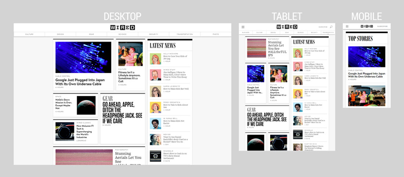
Door No. 1 wasn’t to your liking, so you look behind door No. 2. This option is responsive design, which means the images, text, and layout respond and adapt to the device you’re using. Take "Wired," for example. The tablet view of "Wired" is the same as the view on desktop, but various elements have moved around, resized, or disappeared. Pull up the same site on your iPhone, and the content displays in a simple, single column. Choosing responsive design can save you maintenance costs, as all devices use the same website (no separate URLs). One downside is that users might see a performance drag since all content will be loaded, regardless of what size device they’re using.
Native App
Door No. 2 just wasn’t for you, so you peek behind door No. 3. Door number three shows you what the life of a native app would be like. Native applications, or apps such as the Target app for iPhone or Android, run as a separate app on your mobile operating system (not in the browser). You can design and structure the app as you see fit. Apps are the fastest content-loading option out of the three choices as they are built specifically for your device. Creating an app gives you an array of functions to play around with. You can utilize the phone’s camera, photos, GPS navigation, and even notifications to alert the customer on a product. Be aware of the constant maintenance between multiple devices and operating system versions.
So which design should I implement?
It depends on your end goal. If you’re thinking, "all for one and one for all," responsive design is the choice for you. If you have a bigger budget to deal with, perhaps stick with a dedicated mobile website. If you want faster loading time and customization, a native mobile app is the way to go. No matter your choice, Method will be there to help you out!
How do I get started?
Let Method's website development team assist you in giving your website a mobile-friendly makeover. If you have any questions or concerns, contact us at 844-463-8463 or email us at [email protected]